20.2.26
All kinds of blue
13.5.22
Painting the hedgerows
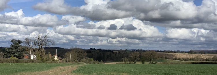
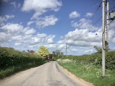
Mid-may and the verges are spattered with Queen Anne’s Lace and sundry other wild pretties, overlooked by copious clouds of foaming hawthorn, which we must not pick and never, ever bring into the house, for fear of bad luck.
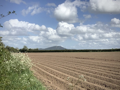
Even the ancient, warty Wrekin is softened with the flush of new green growth.
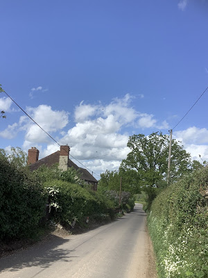
I have aways loved the sight of a narrow country road cutting through the landscape and forging onwards to an invisible end, softly edged by tumbling greenery, blurring the hard edges so that the road, for all its visual dominance, never entirely wins. And here is my own tumbledown cottage, hiding behind the greenery. If you look carefully, further down the lane you can see the lilac tree by the gate of Jean-and-Brian-next-door,
This is a motif that comes out in my own work again and again, as I reinterpret and simply the landscape around me, most recently in these miniature hills, an edition of two. It is also a firm control of the messy chaos of wool, taming the fibres into a solidly outlined object.
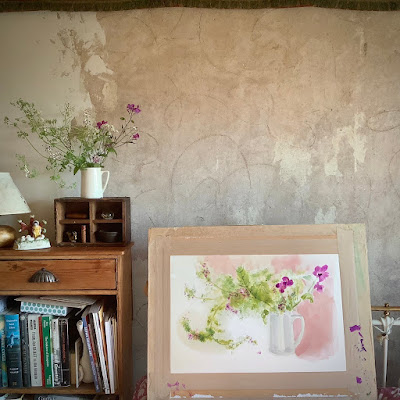
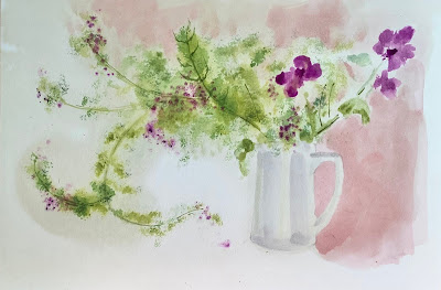
And there is the contrast again, in this large still life I painted last Sunday, with the hard plaster wall being softened and almost overwhelmed by the exuberance of the paint, depicting Fumitory and Honesty spilling out and escaping the confines of the white ceramic jug.
15.7.16
Birthdays and bears
Although I have made time to get on with my own painting.
23.7.12
Comfort
With all the wet weather, fungi and toadstools are already emerging. These woods are mostly conifers, making the woods acidic; perfect for stink horns. There were dozens of them in the first 'egg' form, strangely metallic and translucent.
20.3.10
Paints and palettes.
 (This is not the first one - I used that one up and he bought me this replacement on a later birthday)
 So I was more than happy to give painting a break - I was bored and even resentful of it, and the only painting I've done since then has been for the odd commercial job. (Drawing however, I do love and never stop). But I was so pleased and surprised to have an enquiry from a needle felt customer as to whether I had any original artwork for sale. Yes, but only the two - 'Luna' and 'Little Clown'. And they bought them at once. Which was lovely, especially for my overdraft. This, combined with the enormous amount of painting I have to do for my two jobs, has brought me back round to the idea of painting again. But - my paints have been dying over the years. Look! The 'condemned' ones with red crosses on are the totally dried up tubes; I've had many of these since the early 1990's.
I went through them and realised I hadn't bought more than one or two tubes of new paint in a decade - the last time was back in 2005, just at the time I started this blog and tried out the (then)new 'Potter's Pink'. Not all of the dried up tubes needed replacing - colours like these pinks are so vibrant I only use them in tiny amounts, not for washes, so I can happily use the dry lumps they have become.
 I took the plunge and spent some money. Not only paints, but all the paper I'll need for the final artworks (about 20 A2 sheets), and yet another ceramic palette (I can never have enough).
  And another big roll of gummed strip; the sad little remnant there is all that is left of the previous large one, which was used up over five years. That is, I can tell you, a lot of work. I also had to replace my pencils which get used up within weeks at the moment.
This is my other box of paints; my gouaches and some of my new tubes. I bought everything from Jackson's Art online, who are my main suppliers; apart from their prices, I've never had anything but prompt and courteous service from them, and that's all you really want from a company. I indulged myself and bought several new colours from two brands I'd not heard of before.

Shin Han and Maimeri Blu both make affordable water colours, and Shin Han especially had some gorgeous sounding hues, some of which are opaque, a quality I like. There are all kinds of *rules* about water colour painting and I ignore them all. I mix gouache with watercolour, even though it splits. You just keep briskly mixing it together as you work and this often gives me lovely, strange colours. (One of the other *rules* is that you don't mix watercolours - you layer them. However my entire painting style rests on mixing and re-mixing - it works for me). I made a little colour sample to try out the colours I'd not used before. The Shin Han ones came out on top. I've kept this image large, so that if you're interested you can click on it and see what I mean. The 'Shell Pink' and 'Horizon Blue' are two shades that I'm always mixing up, so it's nice to have it ready to hand. I've always thought of the pink as sticking plaster colour. The Shin Han samples are on the left, the Maimeri Blue on the top left, three of them.
 I don't think I'll be using the 'Lilac' much, (too purpley) but 'Davy's Grey and 'Horizon Blue' are keepers. The one error was stupidly buying 'Green Earth' from the Maimeri Blu range. Of course, it's what I know as 'Terre Verte'. This brand of paint is also quite gummy, which is typical of a cheaper tange. Not something I mind, but I know some people do. The 'Sandal Red' is basically a geranium shade, but a nice one. Here it is with Sennelier's Rose Dore (very red) and Winsor & Newton's Geranium Lake (pale) gouache. But still very tasty.
  An opaque colour I used to use a lot for mixing is Daler Rowney's 'Nickel Titanate Yellow' . When I ran out I replaced it with a Winsor & Newton version, which really was not the same. It didn't have the chalky, lemony bite of the DR, so I'm glad to have it back.
  Another colour I am very fussy over is sepia. It's something I don't use in my commercial work, as it dulls the vibrancy. My publisher once had a prospective book of mine rejected by clients because it was 'too brown'. However I always put a sepia wash in my personal work and it seems to be a selling point, giving it a nostalgic feel. Go figure, as my American friends say. I only have one sepia in my box that I like, and that is an ancient tube of Reeves in lead casing. It has the blackness which marks proper sepia...
  ...here is is on the right, compared to two others I have (Winsor & Newton Gouache and Old Holland) which are really just brown. Actually my favourite sepia is in the Cotman student range, but naturally I forgot to order that one.
  I find it invaluable to keep a record of how I mix colours. This is a big sheet I made about 13 years ago, and I still use it today. Again, I've left it at big size., so you can click on it for more detail There are plenty of examples on it of how I've jumbled Nickel Titanate Yellow with other colours, to produce something I find interesting.
  So when I hit my final deadline (please God) at the beginning of June, I might just start painting for pleasure again, now that I've had my little strop and a two year break. Sorry Dad and thanks again for the paint box.
